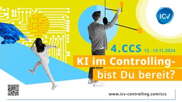
ENG: Fresh, clear, modern: New corporate design for the ICV
"The new logo is part of the overall renewal of the CI, which is already somewhat outdated. We also want to better appeal to new target groups, especially young professionals," explains Prof. Dr. Heimo Losbichler, ICV Chairman of the Board, about the new look. This is intended to convey the performance of the ICV more clearly than before, strengthened by the new claim "Controlling Excellence".
From the designs of the advertising agency Deyhle & Löwe, which was commissioned to revise the logo, a logo was chosen that reflects both the community of the International Association of Controllers with its work groups and the intersection of managers and controllers. The upward-looking "V" in the lettering stands for the successful development of the ICV and, together with the visually sketched check mark, functions as recognition of the guidelines and recommendations developed by the Association.
The energy of the ICV, in which people from different industries meet, experiences and trends flow into one another and create movement, is manifested in the visually lively logo. The brand color blue forms the anchor and the connection to the previous ICV logo. It is complemented by a revised color palette with fresh complementary colors with orange and yellow-green.
In order to underline the new brand identity even more clearly, the font family "Noto Sans" replaces the previous house font Helvetica and, together with the logo, the colors and the new design specifications, forms the basis for a fresh, clear and modern appearance. "This is also a good visual signal for the departure into the future," summarizes Heimo Losbichler. The new corporate design will gradually be incorporated into the overall appearance of the ICV.

